
Typography is the study of typefaces, and the manner in which the type is laid out, to best achieve the desired visual effect and to convey the meaning most effectively. Typography is a lot more than selecting a few fonts and using them in Design. It is important to understand the meaning behind each category of typeface and which typeface is right for the Brand. Think of a famous Logo. Okay, ready? Try and visualise that Logo in a different typeface. It will elicit completely different feelings. Thus, typography plays a very important role in developing strong Brand Identity.
Using Bold, Italic and Underline formatting tools are great to communicate effectively. But, they should be used selectively. Bold is used to highlight a word / point, all CAPITAL letters to convey domination or authority, and italics to give background information. These are basic and minuscule points, but very important for good typography.
Right typeface can convey intended Emotions, as it makes the Brand appear Authoritative, Serious or Fun - in line with the Brand Personality. An essential part of understanding typography is to start with type categories.
Typefaces can be classified in 5 Broad Categories –
1) Serif 2) Slab Serif 3) Sans Serif 4) Script & 5) Novelty

1) Serif: Serif typefaces are those that have distinctive “Accent / feet”. They are identified as serifs because of small terminals that protrude out from the edges of letters. Serifs are very easy to read and book publishers love this category of typeface. They create a subtle visual connection between the letters and have excellent readability even in small sizes. They are great for long paragraphs. Key Characteristics: Authoritative & prestige. Famous fonts in this category: Times New Roman, Bodoni & Baskerville.

2) Slab Serif: Slab serif are a sub-set of serif typeface. They are identified by thick, block-style feet that jut out from the letters. Because of their bold rendition, this category of typeface is most commonly used in headlines but are rarely used in body copy. Key Characteristics: Strength & Boldness. Famous fonts in this category: Rockwell, Courier & Museo Slab.
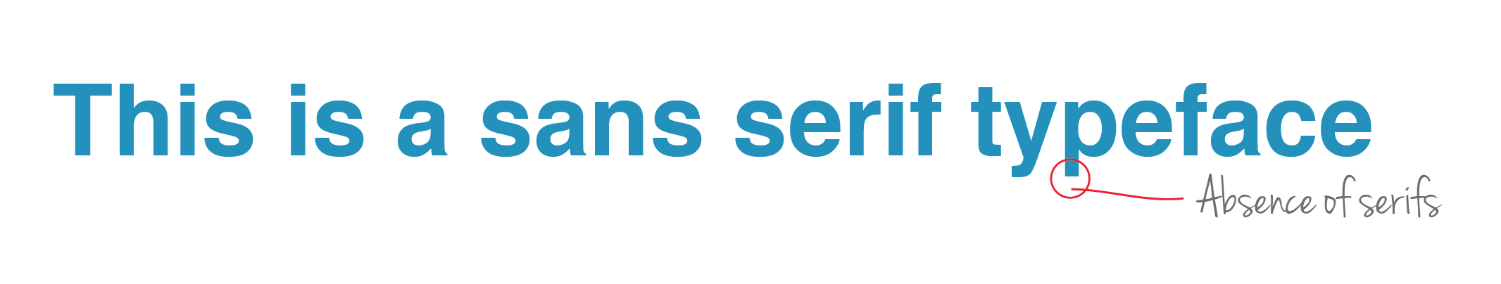
3) Sans Serif: Sans Serif can be easily identified as Sans-Serif by the conspicuous absence of the feet (sans means without). Sans Serifs are clean, well-spaced out and geometric, making them easy to read in large or small sizes. Sans serifs are very popular for headlines, bold statements and body copy. Key Characteristics: Approachable & to the point. Famous fonts in this category: Helvetica, Myriad Pro & Futura.

4) Script: Script typefaces resemble handwriting. They look amazing for logos & small headlines. The finesse and style reflected by this category of typefaces make the Brand appear elegant, while also connoting handmade or hand crafted nature of the Brand. Key Characteristics: Pally, personalised & casual. Famous fonts in this category: Zapfino, Brush Script & Pacifico.

5) Novelty: Novelty fonts are every other typeface whose characteristics do not fit into any of the categories above. They are used mainly for decorative purposes and create a definitive mood based on the look of characters. Avoid using novelty typefaces for large paragraphs of text. Key Characteristics: Fun & non-serious. Famous fonts in this category: Heartbreaker, Grinched & Ice Age.